
Responsive Website Design: Web presence done right
What is Responsive Web Design?
Put simply, a responsive website is a website that responds to the device it is being viewed on. So, if you view the same website on a mobile phone, tablet or good old computer then it will look perfect on that device.
That’s not to say it will look the same. It will dynamically change its appearance so that the content, images navigation and features adapt to be perfect for the browser viewing it. It helps the user experience and will be instantly familiar to the person operating it.
Clever hey!
If you want to see it in action then check out https://www.rcbaker.co.uk/ on your computer. Now check it out on your phone or on a tablet:
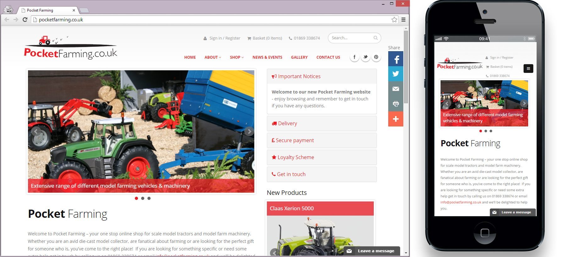
See how they are different? It’s important to realise the content isn’t being re-written. There isn’t two, three or four copies of the website jumping around. It’s just one website, with a very clever design.
So, why does my website need it?
Responsive web design isn’t a gimmick – and it’s not new either. However with rise and rise of mobile devices and new devices appearing with new layouts each day, having a website design with just a single type of user in mind (e.g. Joe Bloggs on Typical A computer) is likely going to cost you an audience or two.
Coffee table browsing is as important as ever, so it’s equally important that your website looks its best no matter how it is viewed.
Can’t I just have an app for phones and tables?
You could develop an app for each device instead. But where do you stop? iPhone app, Windows Phone app, Android app, Windows 8 app, Chrome app…. The list goes on.
With a responsive website you only have to maintain one source of content and one site. It’s more cost effective and future proof – no matter what device comes along your site would adapt to it.
Also, not all sites really suit a dedicated application. Don’t get us wrong, some do (commerce apps, games, promotions, etc), but you need to think about how you expect visitors to find your website. Most aren’t going to do it via an app store. They are going to find it through searching, in which time investing in your website is going to be the best course of action.
There must be a downside?
You do have to think differently when using a responsive design. Thinking your content is static, such as wanting a particular bit of text wrapping, or image positioning, isn’t the way to go. Everything is fluid and designed to move so it can take a bit of thinking and testing as you go along.
If you are interested in more examples, check out our portfolio. Alternatively there are some great looking designs out there you can use for inspiration: http://designmodo.com/responsive-design-examples/
Another great resource (thanks for reaching out to us!) talking about responsive design is 6 killer web design tips
Tips and Tricks for working with responsive content
Speak to your developer on how to get the best out of responsive content. They will help you get the best out of your website design.
To make it easier, consider:
- Testing your content - get hold of a mobile, a tablet and plenty of versions of browsers on your computer
- Using free tools - if you don't have all the devices to use, make use of free built in developer tools to resize your brower to act like a phone or table. For Internet Explorer see here, for Chrome try this and Firefox this
- Being careful with images - images are important, but they will scale very differently on difffernt advices. Make sure the centre of your images contain the important focus as they can easily be cut off